While minimalist aesthetics are sometimes described as “simple,” experts know what is hidden behind that term. Such a style is a choice for those who want to achieve attractive and functional results simultaneously. Its simplicity is stunning because of the use of striking tones, negative space, font combinations, and valuable features. Most designers are unwilling to risk crossing the boundary between basic and primitive. Keep reading if you’re brave and want to learn how to make a great timeless minimalist design.
Be Straightforward
As a style, minimalism originated in Japan and spread around the globe in the 1960s. It was some antidote to the mayhem of city life concepts and the excesses of abstract expressionism. Turning to minimalistic aesthetics for designers was a lot like clearing disk space for users, it felt similar on different levels. When too many files are on your computer, you can’t focus and lack functionality.You can read here are more about managing storage on Mac, cleaning up disk space, and boosting your device’s productivity. Minimalism does the pretty same thing for your design.

This style relies on clean, uncluttered elements. However, everything is more complex. Even plain pictures may be challenging to create. Making the finished design seem easy requires significant effort. A designer might begin with a small typeface and palette to simplify the process and save time. It is also an excellent idea to think about a few important visual aspects and how to draw attention to them. Choose words that go with the image, and you’ll have a foundation to build a straightforward layout.
FURTHER READING: |
1. 5 Types of Logos That Kicks-Ass |
2. Designing A Business Logo: Everything You Need to Know |
Use Fewer Colors
What is the first thing one thinks about before creating a modern business logo? The answer is palette choice. The scheme should have no more than three or four colors, and they must all be as easy to read as possible. Select a hue to be the focal point. Such a tip works as an emphasis or foreground tone, depending on how you use it. Continuously using your favorite palette will make it stand out in a simple design.
Create Clean Modern Logos By Reducing The Number Of The Patterns
It would be ideal if the logo’s unnecessary parts were removed. If you want a logo in this style, make it as basic as possible. Go for simplicity with as few lines as possible and ensure each one serves a purpose.
The fewer elements a logo has, the greater its significance and impact are. It’s understandable that certain things cannot be eliminated. Take just what you need and leave the rest behind. Extreme simplicity often makes the designs memorable, instantly recognized, and nevertheless attention-grabbing. By removing the unnecessary parts, the critical elements become more noticeable.
Pick The Best Typeface For Your Modern Business Logo
The font is a distinctive and compelling aspect of any design. Including the proper type in the logo will help it better represent the brand’s values. The choice depends on your image and history. For instance, using a futurist font might convey the idea that the organization is innovative and forward-thinking. By sticking with a time-tested typeface, the business may demonstrate that it understands and respects its heritage. The primary rule is the type should be neither blind nor too flashy.
Leave Enough “Air”
Just because the piece is intended to be minimalist does not mean its components need to be crammed together. Don’t crowd things, and treat everything with the reverence it deserves. A secret behind clean modern logos is the careful use of the negative area. Aligning components at the proper distances from one another makes it seem more polished and deliberate. Clever use of space isn’t always apparent at first sight, but it’s crucial. However, don’t leave too much air as well. Another way is that it will seem like a waste and likely annoy the target audience.
Strive For Harmony
To create visual balance, it is essential to discover ways to offset the heavier features with either lighter ones or empty areas. Minimalism initiatives sometimes wind up needing to be more concise. Throw things off balance by setting up a countermeasure. This will ensure that the overall composition looks decent.
Be Creative With Empty Areas
Using negative space creatively can be a real advantage. Look at the blank area between the items as a canvas for a whole picture. When used on the modern minimalist logo, this approach makes it seem more natural and dynamic. Using such space as a part of your idea can make your work stand out.
Use Geometry
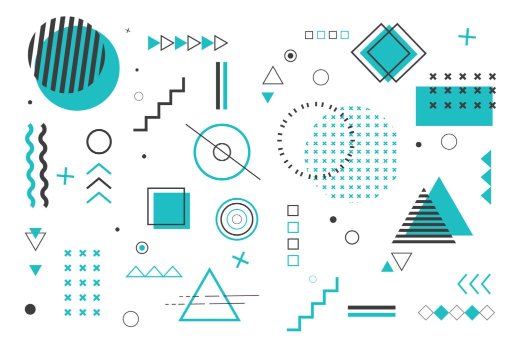
Minimalist logos rely heavily on geometric looks. The lines, the typefaces, and other components should be geometrically correct and attractive. It may be computed with the assistance of the Fibonacci sequence or other indications. Geometry has the power to make things distinctive, despite all the supposed simplicity. One of the brightest examples is the Adidas logo. The uniformity of the three stripes makes for a great and memorable design.
Conclusion
Minimalism can give a lot to your designs. Many big brands prefer this style because it attracts attention. In contrast to logos that pack in as many visual components as possible, minimalistic designs keep things simple. They represent a universal principle applicable to a variety of contexts and media. Its inherent straightforwardness makes a minimalistic design memorable in consumers’ eyes. We hope our tips help you create striking and timeless designs for your business.
Also published on

Share post on