In a broader approach than just automatically resizing display dimensions across multiple devices, the technique of Responsive web design requires a more logical and conceptual way of thinking. For example, how to deal with the difference in content organization between a landscape and a portrait layout? In today’s market, more devices with a diversity ratio are launched. Is there any formula to enable switching among different orientations automatically based on the user’s whim? We will discuss more in this article.
What Is Responsive Web Design?
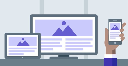
Responsive Web Design (RWD) refers to a practice in web design that supports modifying on-screen display arrangements elastically among devices with a variety of dimensions. This practice ensures an aesthetic, consistent, and intended on-screen presentation of layouts, texts, and images. These elements will be arranged responsively along with appropriate resolutions across specific devices such as desktops, tablets, smartphones, etc.
The 3 Key Features of a Responsive Web Design
According to Ethan Marcotte, a web design/development who conceptualized responsive web design, a web is considered “responsive” when having three key features:
- Fluid Grid: Building a website based on a flexible grid foundation.
- Flexible Visual: The images must be flexible themselves
- Media Queries: Triggering different views in correspondence to contexts.
To understand how these features work, let’s dwell on their concept.
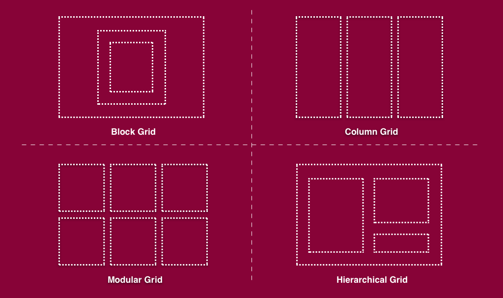
1. Fluid Grid – Automatically fit across devices
The implementation of Fluid Grid design acts on the alignment concept, a basic principle of design. The grid-based design allows web designers to separate the layout into multiple columns and rows. This function also simplifies the design by offering custom arrangement and alignment tailoring to content. The grid behaves responsively corresponding to the available screen width to ensure a smooth user experience on each device.
Basically, the grid acts based on a harmonious workflow between CSS and percentage.
A fluid grid is created using CSS. Later on, the columns will be able to resize automatically to fit the screen interface, whether users are using a 14-inch laptop, an 8-inch tablet, or a 6-inch mobile phone.
Recommended reading: 5 Best Benefits of Responsive Web Design for Your Business
Grid makes use of percentages as an alternative to pixels
Pixels are integers that web designers have to modify manually. Meanwhile, percentages are relative measurement units that allow adjusting the size proportionally to various displayed dimensions across the mediums. This means no matter what your device dimension is, the web layout can adjust flexibly (upon the percentage) and automatically (thanks to CSS) itself.
In order to define a flexible grid, the following elements are important to concern:
- Columns, Rows, and Sizes within the Grids
- Vertical and Horizontal gaps, spacing between the grid elements.
- The flow algorithm when there is any newly added element.
Nevertheless, most existing grid systems in fact restrict the application of CSS classes that define size, space, and alignment. Overusing these layers on a responsive web design can cost time and make it more complicated instead of coding your own.
Fluid layout stated Marcotte that will “put control of our designs firmly in the hands of users and their browsing habits”. A fluid grid helps balance and ensure a consistent look and feel over various devices. Moreover, it is also a hassle-free solution for designers that create one size fits all designs when updating new versions.
Example of Code
A fluid grid system stands as a pivotal method in terms of responsive web designs. It effortlessly adapts to diverse screen sizes, providing a seamless user experience. Let’s delve into a concise example of CSS code illustrating this dynamic grid.
.container {
  width: 100%;
  max-width: 1200px; /* Tailor this to your preferred max-width */
  margin: 0 auto;
}

.row::after {
  content: "";
  clear: both;
  display: table;
}

.column {
  float: left;
  width: 100%;
}

@media screen and (min-width: 600px) {
  .column {
    width: 50%;
  }
}

@media screen and (min-width: 900px) {
  .column {
    width: 33.33%;
  }
}
The code snippet is structured for clarity. The .container class encapsulates and centrally positions the content, defining a maximum width for optimal display. Rows and columns play a pivotal role, each column gracefully floating to occupy the entire row width.
Responsive magic unfolds with media queries; when the screen exceeds 600 pixels, the columns gracefully adjust to a 50% width. As the canvas expands further, hitting the 900-pixel mark, the columns elegantly narrow down to 33.33%. It’s the essence of responsiveness — a visual ballet ensuring content allure on devices of all dimensions.
Such fluid grid systems can evolve, adding nuances like gutters or spanning columns. This example serves as a foundational glimpse, offering a springboard for intricate designs tailored to diverse needs.
2. Flexible Visuals
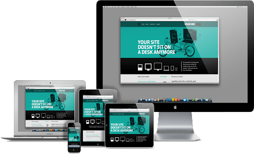
Image is another essential component of a website. To make the website fit completely with the screen size, along with content, the visual also must be flexible. This means there are certain commands to limit visual spaces on smaller devices.
To prevent images from exceeding their containers and adjust their size proportionally when shifting to smaller interfaces, web designers can simply crop them with CSS. The CSS overflow property allows designers to crop the image flexibly and load it appropriately to the screen size.
Example of Code
Responsive web design thrives on adaptability, and flexible visuals play a crucial role in this symphony. Let’s delve into a simple yet potent CSS example that empowers images and media to gracefully fit the contours of their containers.
img, object, video, embed {
  max-width: 100%;
}
In this snippet, the magic unfolds through the max-width property. For img, object, video, and embed elements, it’s set to 100%. This dynamic setting allows these elements to scale up but within limits. The container becomes their stage, and they dance, scaling elegantly but never breaching the boundaries.
The brilliance lies in the simplicity — a resounding 100% width ensures these media elements adjust harmoniously. No excessive dimensions; just a responsive, optimal viewing experience tailored for varying screen sizes.
By restricting the width to the container’s embrace, the code ensures that images and media stay within bounds, enhancing the user experience, especially on smaller screens. It’s not just code; it’s a gesture, a commitment to visual excellence across the digital landscape.
Recommended reading: 10 Best eCommerce Website Design Services for Success
3. Media queries
Media queries allow the website to detect the user’s device type to present a suitable proportion to the screen. With media queries, it supplies designers with building multiple layouts based on user-side display parameters. For example, media queries deal with the browser display’s size, page orientation (portrait or landscape), colors and resolutions, etc.
Most people prioritized media queries as the main component of a responsive web design. However, the fact is media queries operate smoothly only if there is an existing implementation of fluid grids and flexible images.
Substantially, the query comprises of two-element: a media type with expressions that check the condition of distinct media features of a device. This is why media queries go beyond determining the device type since they also inspect the physical characteristics of the device.
In addition, media queries allow website designers to think outside of the constraints of a screen size of resolution. Instead, they can create more flexible adapts to all different mediums, which provides a more tailored experience for the users.
The ever-changing device market has given an upward rise to responsive web design services. There are advantages and disadvantages of responsive web design, let’s discover them!
Example of Code
Media queries emerge as the choreographers of responsive web design, allowing styles to dance with the characteristics of diverse devices. Dive into this straightforward CSS example to witness the magic unfold.
/* Default styles that apply to all devices */
body {
  background-color: lightblue;
}

/* Styles that apply when the browser window is 600px or smaller */
@media only screen and (max-width: 600px) {
  body {
    background-color: orange;
  }
}

/* Styles that apply when the browser window is between 600px and 768px */
@media only screen and (min-width: 600px) and (max-width: 768px) {
  body {
    background-color: lightgreen;
  }
}

/* Styles that apply when the browser window is larger than 768px */
@media only screen and (min-width: 768px) {
  body {
    background-color: lightpink;
  }
}
The journey begins with default styles embracing all devices, casting a light blue hue upon the canvas. Yet, the real spectacle lies in the responsive transformations orchestrated by media queries.
As the browser window size evolves, the background color of the body morphs accordingly. At 600px or smaller, a vibrant orange takes center stage. In the mid-range, between 600px and 768px, a refreshing light green backdrop emerges. When the window expands beyond 768px, a delicate light pink sweeps across, signaling a larger canvas.
This isn’t just code; it’s a responsive saga, ensuring your webpage dons the perfect attire for every device. Media queries bring forth adaptability, making your styles dance in harmony with the ever-changing dimensions of the digital stage.
The 5 Advantages of Responsive Web Design

1. Save Maintenance Cost
Having a Responsive Web means there is one consistent version that runs compatibly across the devices. Therefore, if there are any bugs or new versions to fix and upgrade, web designers will only need to proceed with them once. If your website has two versions on desktop and mobile, the upgrading cost and maintenance might be double.
2. Effective SEO and Content Management
RWD provides only one URL, which reduces the SEO cost while enhancing its effectiveness. Additionally, it is also feasible and time-saving for uploading and managing content.
3. Build consistent Brand Awareness
One of the essential elements of Branding is consistency. RWD allows the web to run consistently across the devices, which ensures consistency in branding presence and identity in the eyes of audiences, thus enhancing brand awareness.
4. Utility in Manipulation
The unity of UI provides more user-friendly browsing and navigating actions on the website. Thus, this leverages the UX and triggers users to explore longer on your site.
5. Optimize Page Speed
Complex effects and slides might cost time to process and load page data. RWD satisfies the users’ impatience by compressing the files and offloading heavy data, which speeds up the loading time.
Recommended reading: 6 Best Web Design Companies and How to Choose the Right One?
The 3 Disadvantages of Responsive Web Design
1. Time-consuming at the beginning phase
An implementation of a website responsive design will focus more on techniques and designing tasks at the beginning phase. The preparation of different scripts to meet specific requirements is a time-consuming process. Yet, similar to operating a company, well-structured flows at first will deliver smoother and more efficient workloads for long-term use.
2. Reduce the value of communicating messages
By cutting down on the image sizes or constraining the display of some information, RWD might decrease the meaning of delivered messages. Thus, there will be a requirement for designers that own such subtle aesthetics to arrange the layout and CSS as well as present the best visual tailoring to every screen browser.
3. Over-layered Navigation Bar
A neat and logical navigation bar is essential to keep users feel eager to explore on-site. If the navigation bar overuses layering, it will cause hassle for users when browsing on mobile devices. A convenient navigation bar is also a factor web designers should consider when designing UI on small mediums.
Practice makes perfect as nothing is perfect from the first draft. An iteration of testing and adjusting will enlarge the use cases and apply them to optimize the design on multiple devices. A good Responsive Web Design service should offer a balance between simple design and user-friendliness in browsing information.
Recommended reading: Web Design and Development: What You Need to Know Before Starting?
The 3 Best Practices of Responsive Web Design
In general, the best practices of Responsive Web Design implement horizontal multi-column layout on the computer resolutions while maintaining the single-column on handheld devices. The following examples might give a clearer zoom into the practical cases:
1. Shopify
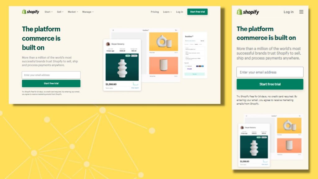
Shopify has done a great job of keeping the user experience consistent across multiple devices. Hardly anyone feels the difference between the desktop and mobile interface as the illustration and layout present a similar look and feel.
If yes, there is an adjustment of the navigation bar. On the desktop, the web navigation bar divides into two groups: one with flexible navigation to explore the on-site content, and another with more functionality actions such as signing up an account. Meanwhile, on handheld devices, Shopify transposes the horizontal navigation into the vertical one and packs it into a hamburger button to create a neat and clean mobile interface.
Although the website loads with a bundle of images, the Shopify team keeps its website load speed at a minimum. As one of the leading E-commerce platform providers, Shopify proves an impressive performance on its website.
2. Slack
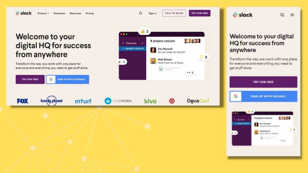
Slack implements a flexible grid thoroughly to fits the display screen of all sizes and shapes. Their website turns the multiple-column layout on their desktop display into a single-column one on mobile resolution. The website also chooses to keep valuable content to focus on while cutting through unnecessary parts to create a clean and simple experience on handheld devices.
3. Dribbble
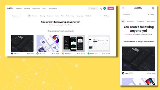
As a design community, Dribbble presents a multiple-column layout on the computer’s screen. This allows users to explore a wide range of masterpieces on every single scroll.
On handheld devices, Dribbble transitions multi-column layouts to a single column that features the artwork vertically. With every scroll, users could explore up to two design works on one interface, which allows the best optical visual while still maintaining the aesthetics of each design. The website also adds the back-to-top button on the bottom-right corner since the presentation of the artworks might extend downwardly.
They also provide an intuitive experience by simplifying text content into icons, such as the icon “eye” which represents the number of actual clicks to view the design.
Final Thoughts
According to the upward trend of launching multiple devices each year, Responsive Web Design services have strived to provide the most flexible and tailored interfaces correlating automatically across device resolutions. Accordingly, more than the resize definition, responsive web design comprises careful calculation to feature visual transitions via multiple browser windows logically and aesthetically. Although the process needs heavy time investment in the early stage, its outcomes are timeless and optimized for later maintenance. Instead of modifying manually across mediums, a responsive web design might be a good solution.
Also published on

Share post on


Table of Contents:


