
It’s easy to come up with an idea to design your website but do you really know how to put things together so that your design is optimized? This article from Designveloper will detailedly show you 6 web design recommendations and best practices when designing a web for you
- How to design a good CTA?
- What tone of theme should we apply to the design?
- How can the illustration fit into your design?
6 Key Web Design Recommendations and Best Practices for Designers
1. Design your CTAs wisely
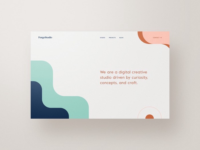
Call-to-Action (CTA) is a really important element to pay attention to when you are designing a website. CTA is the one thing that could make or break your customer decision, and as a result, this graphic element will surely affect your sales.
While the copy of a CTA gives the customer a clue to figure out “why should I click this button?”, the appearance of it solves the myth of “where should I click?”. A good designed CTA should help users navigate and understand their future actions. That’s why CTA is a really crucial element when it comes to designing a web.
Though drafting a CTA button is not a difficult task, optimizing to make a sale through it is not an easy one either. Below are 3 UI tips from Designveloper that could help you make the best out of this.
FURTHER READING: |
1. Designers Should Know How to Code? |
2. 5 Types of Logos That Kicks Ass in 2022 |
3. How to Organize Design Files That Help to Save Time? |
Use contrasting colors
There are many aspects that your button’s color choice should think of such as the color of the whole composition, and the psychological peculiarities of the target audience. One of the most important factors you must implement in your color choice is contrast. As the background and button color are contrasting the CTA could be an unusual element on screens and stand out from the others.
One more thing you should be aware of is the more important a button is, the more contrast it must be. Let’s look at an example:
Choose a bigger size
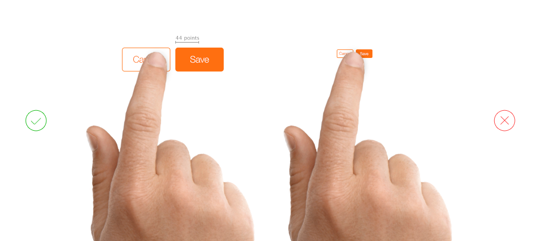
On the one hand, Every designer knows that the bigger an element is, the more eye-catching it is. On the other hand, CTA is made with the purpose to optimize the conversion rate. That’s why a big enough button would draw the attention of the customer more effectively, and there is a higher hope that they will respond to it compared with small and unnoticeable buttons. However, don’t widen the button too much as it will affect other elements and the whole design of your website. There is a tip from Apple suggesting that your button should be at least 44 points x 44 points.
Watch out for the fold line
Above and below the fold line is a concept regarding the printing press. Newspapers are double-folded to put on the stall because the sheets are too large. And this makes the passerby only see the above folded half. That’s why newspapers have to attract customers by putting engaging headlines or pictures on the top half to boost sales. When it comes to designing a website, the fold is related to our scrollbar.
As Tyson Quick stated in his article in Instapage, A CTA placed above the fold can immediately draw visitors’ attention. However, several analyses show that it’s best to put your CTA on the above half only when the majority of your customers have already known about the service/product and want to make a deal faster without any further research.
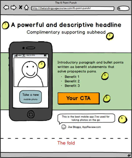
As opposed to this placement is below the fold. It is said that if your customers have no idea what is your service/product then the CTA should be at the bottom of the page so that customers could see some value of the offer. Brad Geddes ran a test on his own real estate website where the call-to-action media were moved below the fold, and the conversion rates went up. After that, he and his team tried putting the CTA back to the top of the page, surprisingly, the conversion index went down.
The example has shown that CTA placed above the fold is not always the best practice. So the two crucial questions towards this are:
– Are your customers familiar with the product/service?
– Are your offerings easy to understand to the majority of your customers?
If you say yes to both questions, let’s lay a CTA on the top of the page. In the case that the offering is hard to follow then you’d better place the CTA below the fold.
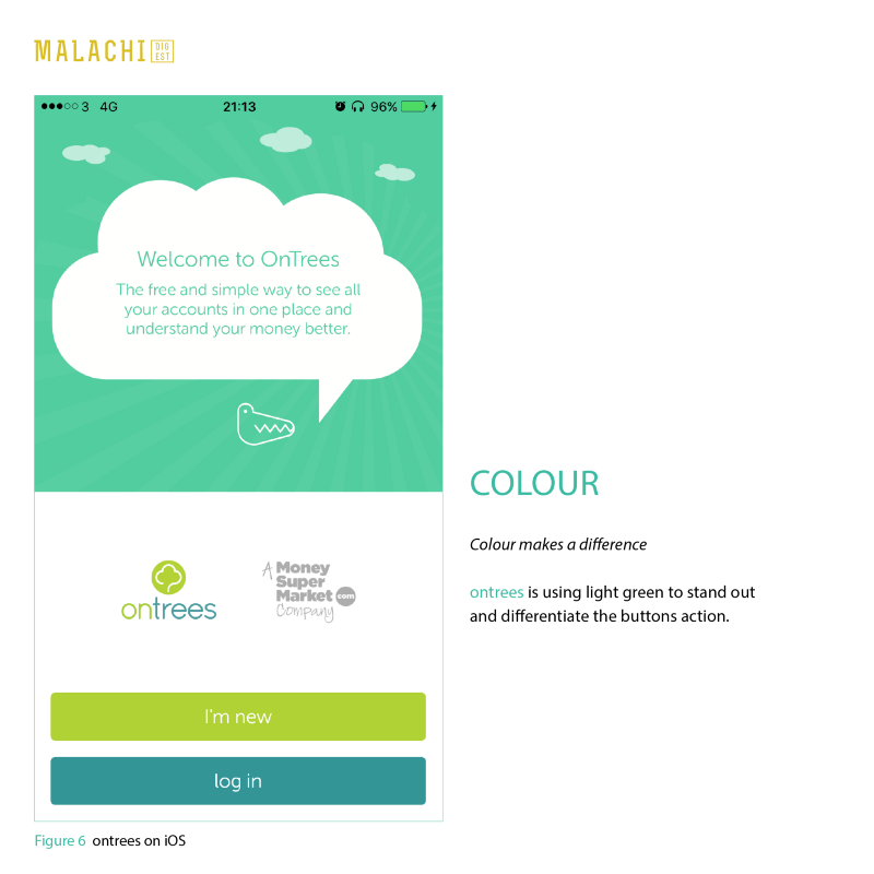
2. Using dark backgrounds
It comes as no surprise that more and more UI designers are likely to choose dark themes over light ones so that the interface they designed would have a stylish and trendy look. In fact, the reasons behind this are various.
Why you should use dark backgrounds
The first reason is that dark background will not strain users’ eyes. Of course, it is easier to read the news, and blog posts with a light theme in a short while. However, when we have to work for a long duration (coding, reading a long essay, etc.), a dark theme with light text is a better choice. It enhances readability and legibility.
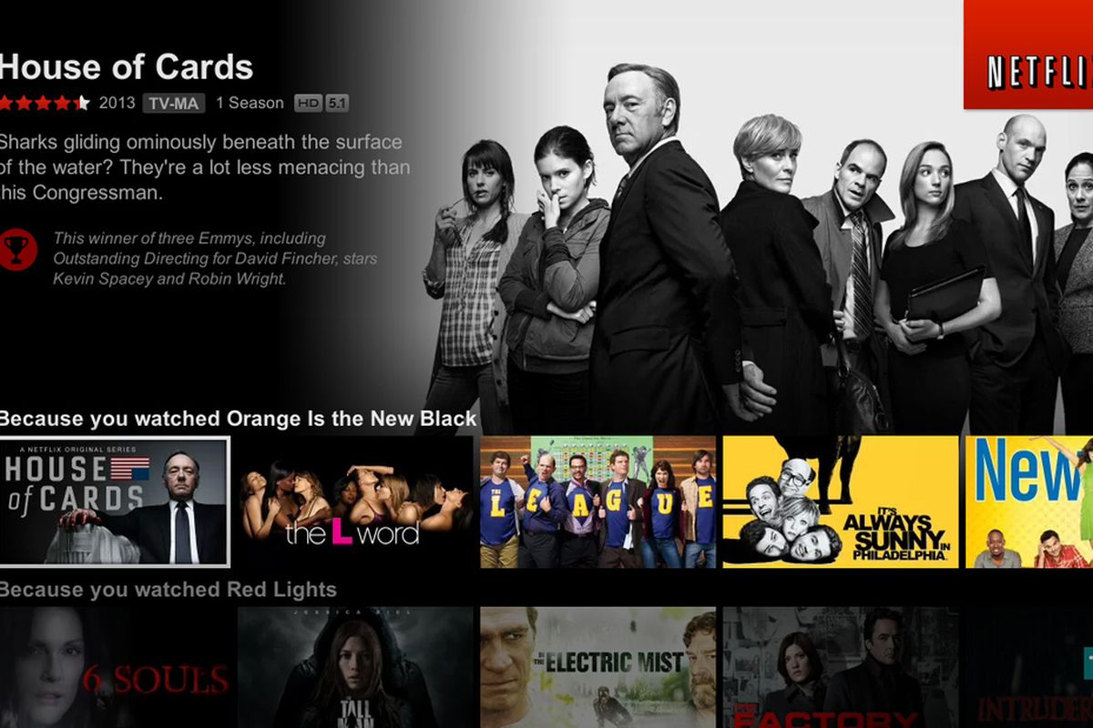
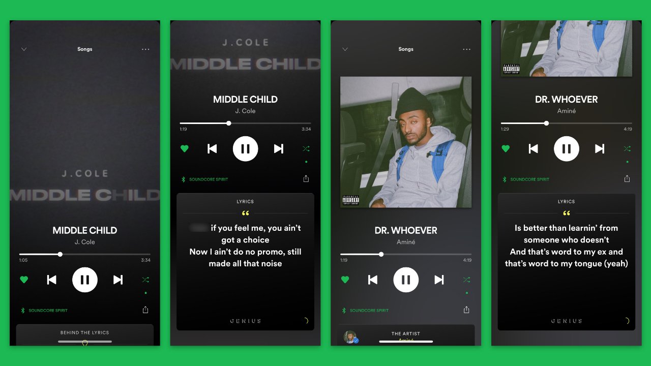
Secondly, if the environment encourages using a dark theme, do it. Are you familiar with Netflix or Spotify? Both of them apply dark themes to their interface. This is because people tend to watch movies and listen to music to relax. According to a report by IFPI, consumers are more likely to listen to music when they are relaxing at home (63%). Regarding Netflix, it is found that its users would stream movies, and series late at night, or in a room with dimmed light.
Another example of this is all of Adobe’s products including Photoshop, Illustrator, InDesign, etc. adopt dark interfaces (like black, and grey) so that designers could focus on their tasks and their eyes could be comfortable when working for a few hours in a row.
Since bright background can cause strain in such an environment and also distract users’ attention, a dark background is always the better option here.
Tip to use dark backgrounds
There are several tips when applying a dark background to your website, including:
- Since dark background absorbs light from other elements, you should make use of negative space so that your users won’t be distracted by relevant information.
- If there are texts in your design, you’d better use sans-serif fonts so that users can easily skim the information on the page.

Best practice for dark backgrounds
If you are still wondering about deciding whether light or dark is the best, here is a checklist for you:
Step 1: Define the purpose of the interface. Is it a text-driven website (blog, news, e-reader)? If so, the light theme is a suitable one. In the case that your website is visually-driven, the choice should be a dark background.
Step 2: Define your target audience. The two questions you should keep in mind are:
+ Who are they?
+ What do they want?
Based on the answer, you will figure out what the best choice is. In other words, if you want to make a website for middle-aged people, a light background is the best practice as this tone is more intuitive and navigable. When it comes to young audiences, dark themes are more original and stylish. However, teenagers and kids prefer bright and engaging themes.
Step 3: Test and test and test. You can never trust any recommendation without testing it first. A/B testing will give you a better view of your audience’s behavior and then you are able to optimize your website as much as possible.
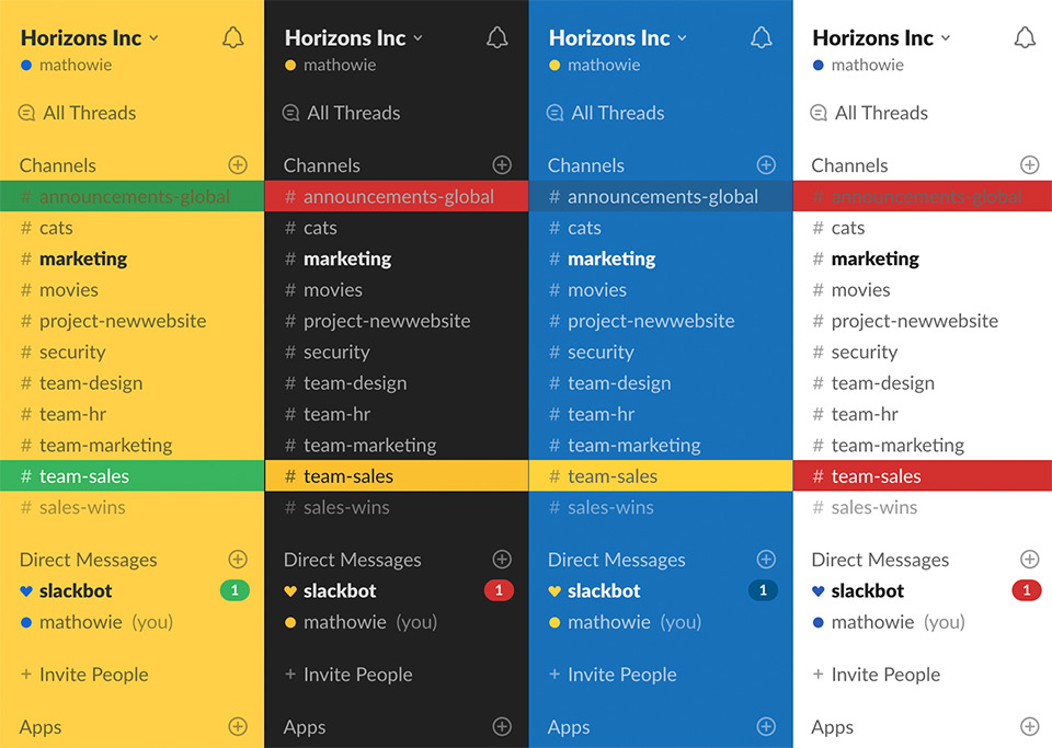
But there are two more choices for you when deciding what tone the background should be. First, your interface could be dark but there has been a white tap for the copy. The other recommendation is to empower your users. Design more than one interface theme and let them choose whatever background tone is suitable for their needs. Here is an example from Slack:
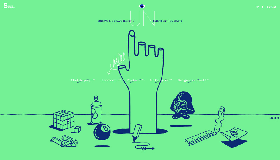
3. Using custom illustrations
This is 2019 and who doesn’t use illustrations on their website? Well, if you are one of the people who are still new to this, below are some reasons explaining why illustration is a must these days.
Generally, illustration is more effective when it comes to grabbing users’ attention compared to texts. Plus, if your work of illustration is beautiful enough, then it will probably satisfy the need for aesthetics of the human being. Therefore, this type of element could encourage a user to keep rolling the scrollbar.
Why we should use custom illustrations
Illustrations are the best web design recommendations from us for you. It can help the audience process data quicker than texts, they will see what you mean in just a second, without having to know the context. Thanks to the recognizable characteristic of illustrations, texts (copies) are well supported and it also helps the information stay in users’ minds longer than usual.
One more reason is that custom illustration enhances brand awareness and recognizability. Illustrations are the one unique factor and experience that brands could give their audience.
What’s more? It’s your work then you can custom and sync it however you want. The artwork could be engaging, fun, appealing, etc. The choice is yours but it should go with the flow of the whole design.
Best practice for using custom illustrations
The first thing to analyze is always your target audience. After that, it’s wise to figure out what the environment of your website is, in other words, if you want to show your sense of humor then a fun pack of illustrations will work.
Next, let’s consider if your illustration is understandable or too complicated for users, don’t make them think, you know! And the final tip is that the work should not be a distracting factor to your website, the main idea of all of these is selling service/product, right?
Those are three practices that we at Designveloper think you should consider for the next project. If you have no expert around to develop your own product, let Designveloper help you. Reach us at our estimation page so that we will have a better view of your idea.
Before you go, don’t forget to visit us weekly for more informative content about software development, product designing, etc. And also, the 2nd part of this topic will be published soon, so stay tuned!
After the first part, we will present you with another article about 3 other tips and best practices when it comes to web design. This second article will include:
- How to use negative space in your work?
- How minimalism is practiced these days?
- Will consistency affect the design?
And well, if you miss the first part of this article, just click here to read it.
4. Using negative space in your design
What is negative space?
In recent years, designers, especially those who work in UX/UI field are using negative space more than ever for various reasons. But where did it come from at first?
Basically, negative space is often referred to as white space. This is a term used in various print design tasks such as book, magazine, and newspaper design. The space around elements in print design is often white, so designers use this color to call untouched and blank parts in pages of books, magazines, or any other print works.
However, negative space was originally used in photography where photographers see it as the area surrounding the main subject. And well, it doesn’t have to be white.
In web design, this element is the space found inside and surrounding other elements like typography, buttons, texts, lines, etc. It can be in logos, illustrations, posters, etc.
Some other subterms regarding negative space are:
- Micro: it is the small space between elements like lines, paragraphs, and grid images.
- Macro: this kind of negative space is placed between majored layout elements.
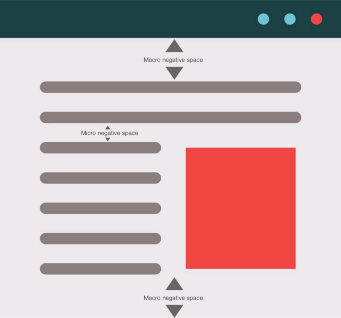
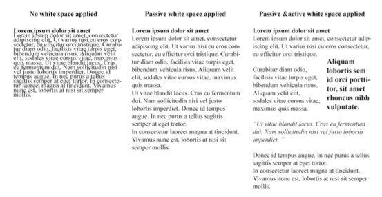
- Active: used to clarify the structure of your web page and also help to guide users through the page’s content.
- Passive: used to improve the aesthetics of the layout.
Benefits of negative space
As in a website, negative space will enhance your web design one way or another. Below are some of its benefits when designers adopt this element in their works:
- Keeping the balance between elements like words and pictures.
- Creating contrast by proximity/distance between objects.
- Clarifying the relationship between layout and component.
- Buffering the bond between elements in a layout.
- Making the design less clumsy by strengthening the visual hierarchy.

These factors mostly help users perceive information better thanks to the fact that negative space will eliminate all the distractions. Furthermore, this tool also adds style and elegance to the website.
How to use it in a web design
Generally, negative space is the most needed aspect of graphic design. However, when designers practice it well, clients and users can hardly recognize this bit, or else, negative space could jump off the screen and scare your visitors stiff. So next is some recommendations on how to executive this element in a design:
- Understand the differences between macro and micro white space as well as active and passive white space. Pay close attention to them because the devil is in the detail, you know.
- Keep other objects interesting, and natural to power up the effect of negative space.
- Be consistent in your negative space draft.
There are several factors that likely affect negative spaces in a design: legibility; design tone and branding; focus and attention.
FURTHER READING: |
1. Top 20 Best Prototyping Tools for Designers in 2023 |
2. UI vs UX Design: Definition and Why This Comparison Should Not Exist? |
3. UX Design Careers: What You Need to Focus On? |
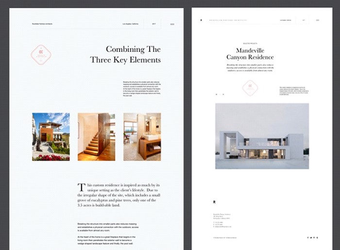
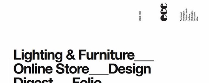
5. Minimalism in web design
What is minimalism?
Chances are that you have visited these types of websites many times like these:
This happens due to the fact that minimalism (or the art of less, according to Steelkin) is one of the most popular design approaches at the moment. In short, to design a minimalist website, designers will eliminate unnecessary elements or contents that are not helpful.
Many experts guessed that this trend comes from the International Style, the style of design which was a trend back in the forties and fifties of the 20th century.
As for the digital age, ever since adopted by Microsoft (in Windows 8) and Apple, minimalism has become the biggest trend in the web design industry.
Why you should use this technique in your web design?
The reasons are various, it may be because:
- Minimalism is the biggest trend right now, and it will only get trendier.
- Websites that used this kind of technique are easier to make responsive.
- Your website will load faster due to the fact that there are fewer elements on the page.
- Your visitors will be able to focus on important things like messages, products, services, etc.
The Characteristics of Minimalism
Nielsen Norman Group has conducted a piece of research on the movement of minimalism in 122 minimalist websites, and below are all the most used minimalistic techniques.
- Flat patterns, texture (96%). This is the technique that doesn’t use any effects such as highlights, shadows, gradients, etc. to make the website glossy or 3-dimensional. However, the flat style of web design could reduce the legibility of your web and affect your customers’ behavior.
- Limited or monochromatic color palette (87%). Different from the colorful style of the 2000s, today’s websites are mostly made of less than 5 colors. In their research, Nielsen Norman found that half of the samples (49%) used a monochromatic color palette, most of them adopted white, black, and gray in their interface. Nevertheless, you should make sure that the color scheme is contrasting enough to enhance the content’s legibility.
- Restricted features or elements (87%). If you want to get rid of redundant elements in your design to make it a minimalist one, a good plan is needed here. That’s why you should draft a detailed sitemap so that the website won’t miss anything important and eliminate unnecessary bits.
- Maximized negative space (84%).
- Dramatic use of typography (75%). Using one special typeface is like implementing a bold color in a minimalist design, this tool is to increase the impact of a website’s visual without using too many elements.
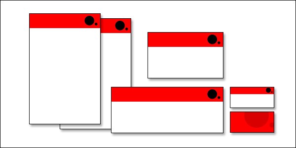
6. Be consistent
In the design world, it is essential to be creative all the time. However, creativeness should go with consistency to make your work friendly and usable. These rules are the best web design recommendations for you when designing your products.
The 2 most important types of consistent web design
- Visual consistency: is how your visual elements such as font, size, icon, and buttons match with each other.
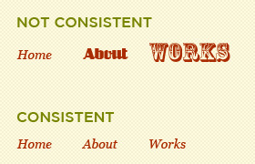
- Functional consistency: in a website, when functions are predictable that’s when you have functional consistency in your design. Thanks to this characteristic, your user will feel safe and secure. And who does not need it?
The benefit of being consistent
Even the most creative designer needs consistency in their work so that it could be a successful product. Below are some reasons that make consistency so important to web design:
- It contributes to the usability and engagement of your website.
- Consistency eliminates contraction.
- This factor will also strengthen the image of your brand in the users’ minds.
Some ways to make your web design consistent
When working on a digital product, it is easy to
- Use a familiar set of elements in your web such as typography, colors, space, grid, size, and positions, or you can just reuse them on a website.
- Your pages may be different in terms of content and visuals but the layout should be related so that the users can recognize your product immediately.
- Do not get rid of the grid in your design. Everything should be perfectly aligned with each other.
And we at Designveloper hope that our web design recommendations will benefit you one way or another. In case you guys have any other tips on web design, leave a comment here. And don’t forget to follow us on Twitter, Facebook, and LinkedIn.
Also published on

Share post on


Table of Contents:


