
Shopping seems to have always been one of the most basic yet fun yet crucial parts of our lives. I mean who doesn’t love to shop, well, most of us at least do. There was a time when shopping seemed to be a tedious job where one had to take time out from their busy lifestyles and shop. And the worst part was, not necessarily end up buying anything. Fortunately, with the severe change in the technological landscape and with the rise of smartphone devices, the entire shopping behavior seems to have transformed all across the globe. So, how can we develop a mobile-friendly eCommerce website?
The Market of Online Shopping
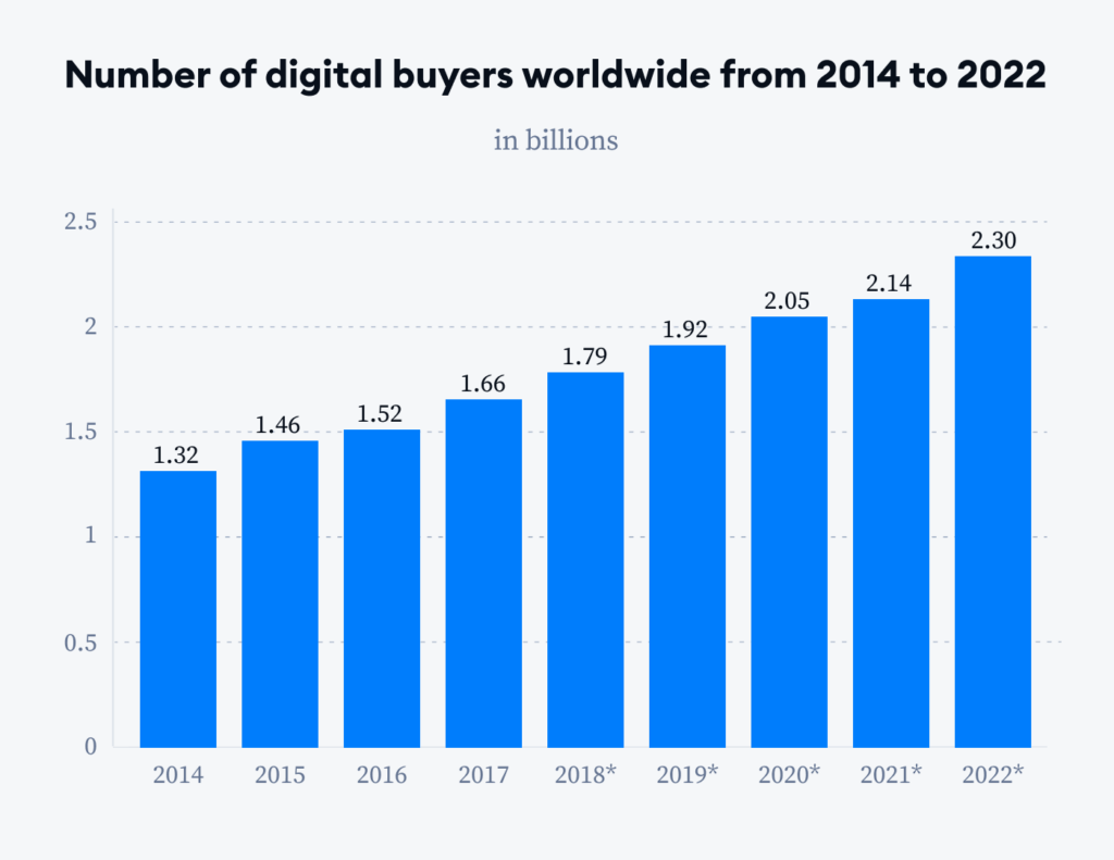
Nowadays it doesn’t matter whether you are a global brand or the local shop around the corner, having a strong online presence such as an eCommerce site or a mobile app has become pretty crucial especially if you want to connect meaningfully with your end users and that too for a long run. It may quite interest you to know that over a span of years, the concept of shopping via smartphone devices has risen to a great extent i.e. around 120% and the numbers keep on increasing every now and then.
In fact, from shopping to buying groceries, travel bookings, ordering lip-smacking food, or any task or micro-moment, we always tend to reach out to our mobile devices. As a result, this means endless opportunities are lying ahead and businesses must start milking such opportunities before it’s too late.
Now what is a mobile-friendly eCommerce website? Well, most of the commonly created websites are said to be the ones where you find content fit according to one screen but not for others. Apart from this, reading the text becomes a task in itself, basically, the overall experience becomes pretty much frustrating.
Fortunately, that’s not the case with mobile-friendly eCommerce websites. Here you need to hire a reputable eCommerce development company featuring experienced developers who begin the project by creating the mobile site version which can be easily adapted to desktops and computing devices such as tablets, laptops, small screens, etc. With the change in the device, the text, images, and everything else also changes and fit according to different screen sizes.
When it is said a mobile-friendly website?
- If the text is large and easy to read
- Seamless navigation even through smartphones
- Touch friendly buttons
- Faster download speed
I hope by now you have decided to create a mobile-friendly eCommerce website. Well, if so you have just come to the right place as the following post focuses on how to do so but before that let us explore the why part. Why there is a need for developing a mobile-friendly eCommerce website.
Importance of Creating Mobile-friendly eCommerce Websites
It may quite interest you to know that more than 70% of the internet traffic is via different mobile devices. As a result, having a mobile-friendly eCommerce website has become a compulsion especially if you want to stay above your competitors. Also, when you create a mobile-friendly website by hiring a reputable eCommerce development company, you are bound to get your website ranked seamlessly and in no time. Who knows after Amazon, Flipkart, Myntra, and Zomato, you might be the next million-dollar venture in line. Further, I would like to mention the crucial advantages of developing a mobile-friendly eCommerce website.
#1 Access
One of the most crucial advantages of considering a mobile-friendly eCommerce website is easy access. If someone wants to buy a particular product from your shop, he or she can do it at any point in time by simply using their mobile phone. At the same time, you don’t have to worry about loading issues, slow websites, or unwanted popups as the end users will directly open the URL through their smartphones and surf freely.
#2 SEO
Another crucial advantage of considering mobile-friendly eCommerce websites is that these websites do get a chance to rank seamlessly in no time. You see most of the time mobile users tend to type keywords instead of navigating links, and this surely generates more and more traffic and sales.
#3 Enhanced User Experience
Another interesting benefit of creating a mobile-friendly eCommerce website is you can offer an enhanced user experience grabbing their instant attention. Also, they can seamlessly go through your site and conduct instant purchases. In comparison to browsing websites over computing devices, mobile-friendly websites definitely offer the upper hand and create a win-win situation for everyone.
#4 More Customer Retention
When the overall user experience gets enhanced, of course, the customer retention rate is definitely going to increase. You see your existing customers can spread the word for you and offer you more customers. Also, if user engagement increases, you will be having long-lasting relationships and they will keep on coming back every now and then. Not to mention, loyalty remains intact here.
#5 Cost Effective
Last but certainly not least, the advantage of developing a mobile-friendly eCommerce website is that the entire venture turns out to be pretty cost-effective. You see when you try creating a website which is seamlessly responsive, all the bandwidth costs are reduced. As a result, you end up saving ample time, energy, and money. In addition, you no longer have to create duplicate versions of your site for different platforms.
And now comes the how part, how to develop a mobile-friendly eCommerce website.
How To Develop A Mobile-Friendly eCommerce Website?

Creating an eCommerce website was once considered a sure-shot norm to succeed. Well, not anymore, today developing eCommerce websites has become pretty normal, instead developing a mobile-friendly eCommerce website is something that can give you a competitive edge by generating an insane amount of leads, boosting conversion rates, and increasing profits to a great extent. One must be well aware of the fact that two-thirds of all global digital traffic passes through mobile devices. Time to get acquainted with some actionable ways to develop a mobile-friendly eCommerce website.
#1 The Page Loading Time
One of the basic tips to take into account is the page loading time. In today’s fast-paced times, slow loading speed is a major turn-off for the end users and they eventually end up switching to your competitors. Now offering a mobile experience like never before is way different from a desktop browsing experience. There are times when data speeds and internet connection tend to be slower as a result, users become impatient and switch to your competitors. Mobile-friendly sites usually take 3 seconds to load so here the page loading time decreases significantly.
#2 Responsive Approach
The next aspect to take into account is a responsive approach. Now a responsive design is said when the content looks the same even on different devices including a desktop, tablet, mobile phone, etc. Wondering why? Well, a responsive web design seamlessly is able to detect the visitor’s screen size and change the layout for better possible outcomes.

With the rise of responsive approaches, businesses are no longer compelled to create different websites for different platforms and Oses. So as a result, developers also feel relieved as most of their burden is reduced significantly. In addition to all this, Google understands what responsive design is and gives it quite an important so you won’t be penalized for having duplicate content.
#3 Progressive Web Applications
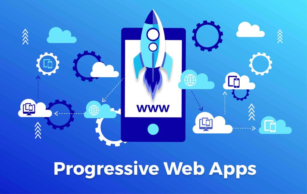
Another interesting trend you must follow is the urge for progressive web applications. Most of the eCommerce development companies these days are found going gaga over this specific trend. There was a time when native app development was quite in vogue. Fortunately, this is not the case anymore. All thanks to the increase in popularity of progressive web app development. Wondering why? Well, there are a plethora of benefits of considering progressive web applications such as:
- A quicker release time
- There are no chances for any miscommunication between business and customers
- Enhanced app visibility
- The enhanced overall speed of the website
There is no point in investing so much time, and money in developing an eCommerce website and losing hundreds of dollars just because the site is unable to load in 3 seconds or the visibility is pretty low. Try using the best mobile-friendly testing tools here. Moreover, hire a reliable eCommerce development company or contact the best team of eCommerce developers who have a knack for creating alluring mobile-friendly websites.
#4 Call-To-Action
Placing proper call-to-actions in an appropriate manner is very important. Not having clear or visible call-to-actions makes everything worthless and you are more likely to lose lots of revenue and interest from the end users. Most of the websites tend to place CTAs above the fold, aka front and center because these are considered to be quite ideal.

Now when you develop an eCommerce site, distractions are pretty much common in regard to unwanted texts, images, phone calls, etc. As a result, most of the time your end user might not be able to complete the purchase in time. As mentioned earlier, today’s customer attention span is extremely short so you need to ensure that users complete the purchase before switching the site. Try to add bold and contrasting calls to action that stand out completely. CTAs should be pretty short and sweet such as Buy Now or Add to Cart or Basket, etc.
#5 Offer a Seamless Checkout
When you create a mobile-friendly website, easy check-ins and check-out are equally important. When this happens, visitors can convert seamlessly, or else they might end up leaving your site in no time. So what else needs to be done? The checkout page has to be user-friendly and deliver the same experience irrespective of the device be it laptop, desktop, mobile and so more.
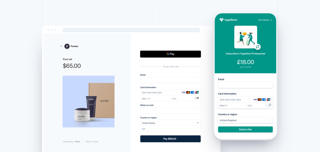
Just make sure to make the phase more and more smooth, straightforward and the process has to be completed in a span of a few clicks only. Basically, it’s all about making the purchase experience hassle-free for the end users.
Final Words
So this is it for now! If you want a significant decrease in traffic, a drop in organic visits, stay behind your competitors, high bounce rates, or poor user experiences then simply keep on using no mobile-friendly eCommerce website. So what exactly will you choose? Remember, it’s never too late to start! Try reaching out to the best eCommerce development service providers in town.
Also published on

Share post on


Table of Contents:


