As the need for web design and development is increasing day by day, designers have chances to practice and enhance their work more than ever. Nevertheless, even the most experienced professionals make mistakes. And you, as a web designer, might break rules sometimes but have not acknowledged them yet. That’s why experts from Designveloper conducted this article to help you learn from those web design mistakes and work with web design more effectively.
4 Common Biggest Web Design Mistakes
1. Focal point? What the heck is that?
Clients like to make everything bigger and leave no space left to calm the design. And this sometimes confuses users when they cannot point out what element they should land their eyes on. This issue either breaks the aesthetic of the site or worse, forces potential customers to leave it since emphasizing everything makes important elements that can not draw users’ eyes.
As a web designer, chances are that you have met clients like that and cannot explain why things won’t work this way. Or else, this is the problem you have never thought of. For your information, it’s all about focal points. So let’s talk about this very first web design mistake.
A focal point is an element or area of dominance that stands out from the whole design. It is used to catch viewers’ attention and make the web scannable. Furthermore, this very element helps to deliver messages quickly and effectively. On the other hand, focal points should answer questions users might have about the page.
1. Examples
For example, let’s look at the heading of spotify.me. The designer emphasized the message “You are what you stream” by using bigger font size and making its weight line thicker. At the same time, he/she used a contrasting set of colors between the background (orange/pink) and the text (navy blue).

2. Solutions
The solution for this issue is simple: put more visual weight on your important element. To perform this, you have to express the difference between your focal point and other elements by varying different design characteristics such as size, shape, color, depth, texture, density, white space, etc.
And here are three steps to create focal points for your web design.
- Step 1: Identify elements you want your users to focus on. Those elements will be your focal point. Remember that the number of focal points could be more than one but don’t let everything scream at the users. So the next step is…
- Step 2: Prioritize the visual weight of all elements on the site. For example: if the call-to-action is more important than the text, then its visual weight should be more dominant.
- Step 3: Emphasize the focal points by changing their characteristics.
Recommended reading: 30 Web Design Trends and Tips to Make Your Own Trend
2. Inconsistent interface
Consistency in design means the elements in UI design are uniform in terms of the look and the behavior. Thanks to consistency, your web design would make no surprise and difficulties when users are navigating the sites. The reason for this is that surprises are bad for experiences: once your users cannot get what they expected, frustration and confusion just come. That’s why there is a very valuable quote that every UX/UI designer should learn by heart “Let’s design for user expectation”.
In short, a consistent interface will:
- increase usability,
- eliminate confusion,
- reduce the learning curve.
Recommended reading: 3 Essential UI Mistakes and How to Fix It
1. Examples
In May 2019, Facebook presented a bold change in its mobile app: modifying the logo in terms of the design (from only the famous F to its whole name Facebook) and the color (from the significant blue to black). This resulted in an interface looking just like another version of the Messenger app. Consequently, many of my friends (please note that they are software developers/designers) were so confused. Another issue here was Facebook itself getting rid of its brand color and making the app so different from its web app. Several days later, they turned the color back to blue, and things went back to normal, no questions or confusion were addressed anymore. So what was wrong with this change?
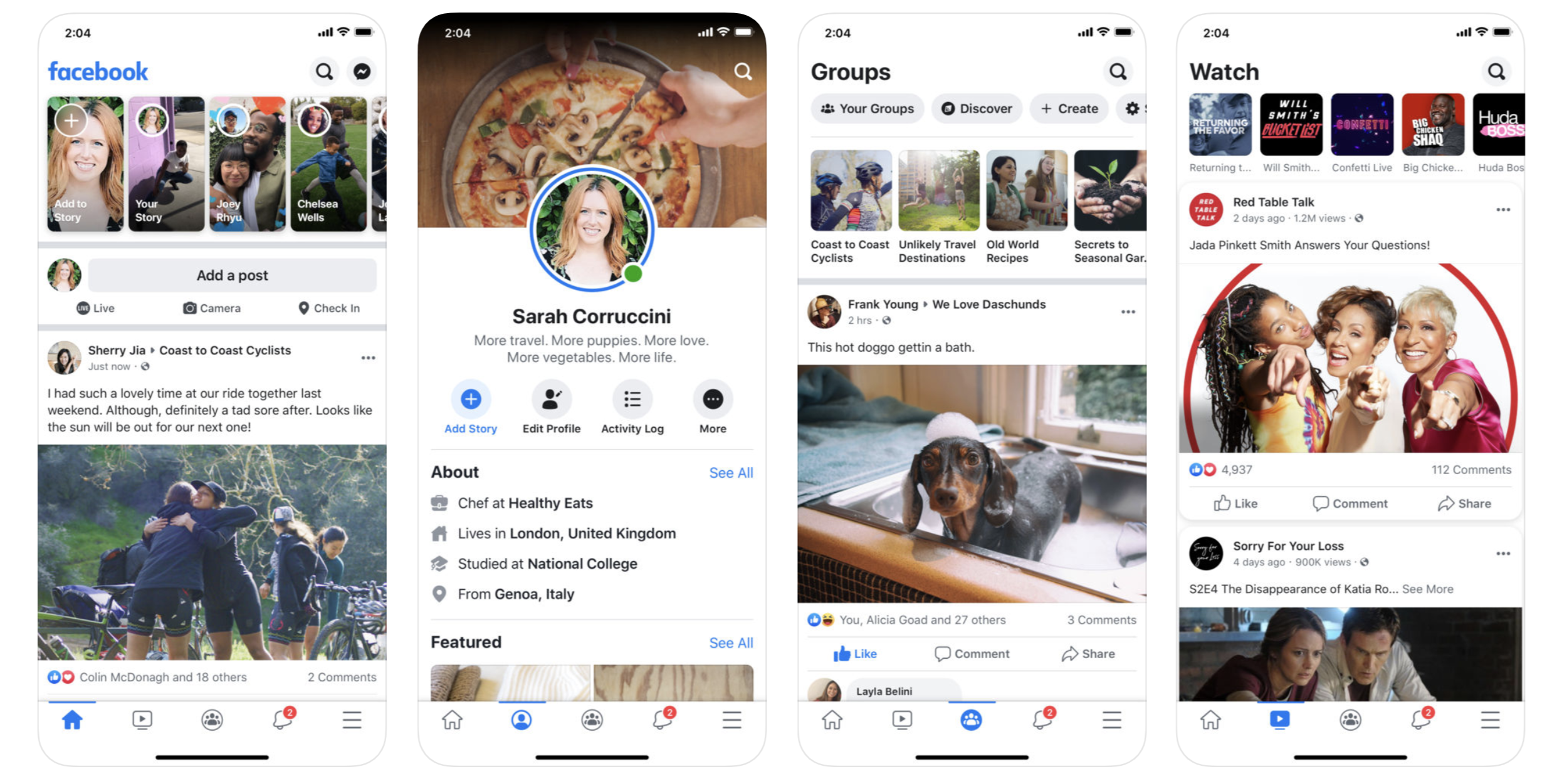
This is one of the common web design mistakes that Facebook’s designer made here was ignoring consistency.
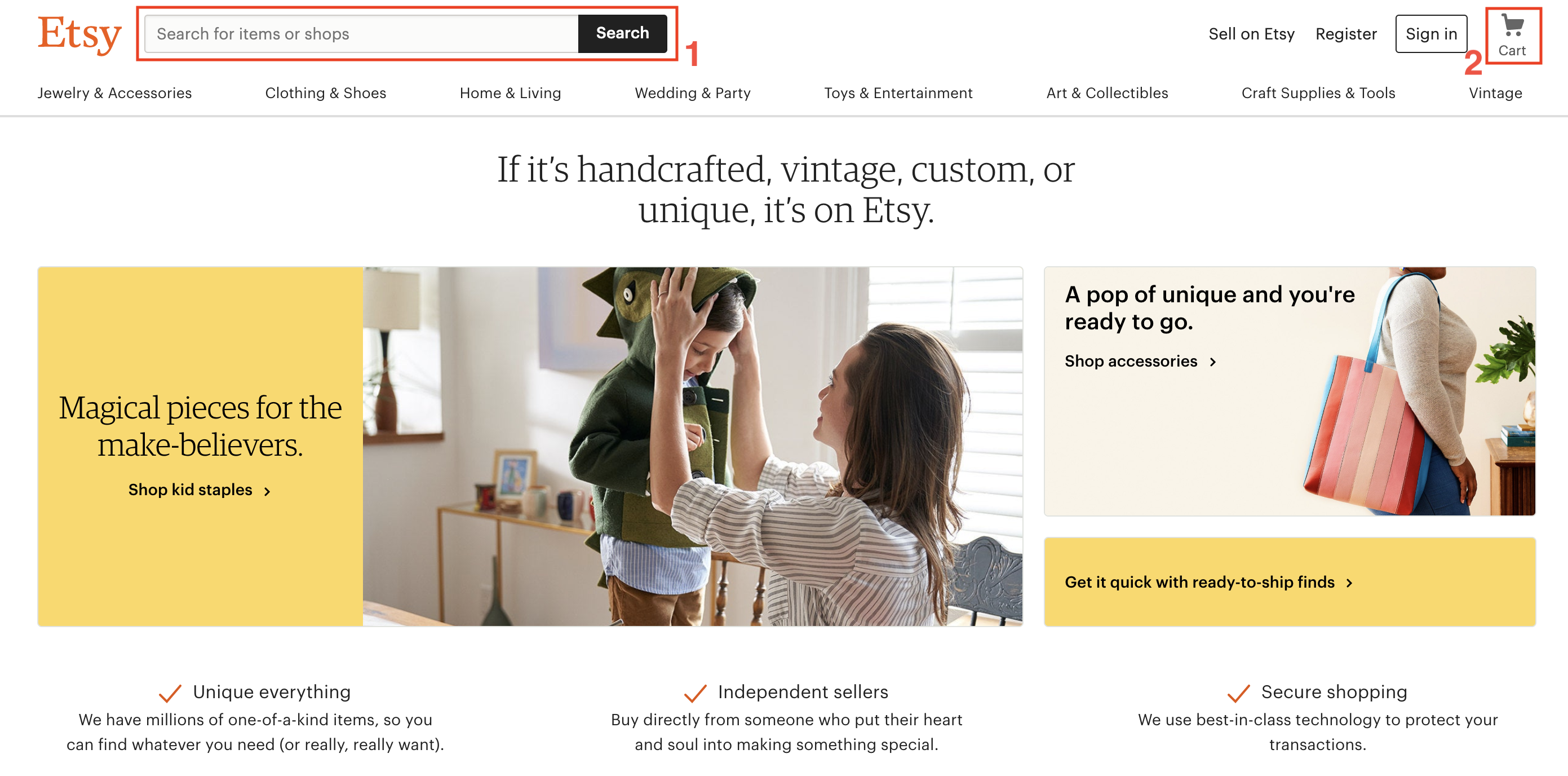
For another example, when it comes to eCommerce websites like Amazon, Etsy, etc., search bars must be in the top-left corner (1) and the shopping cart must be in the top-right corner (2). Thanks to this unwritten rule, end-users don’t need to seek these two important elements.

Last but not least, all interfaces should be consistent with your own design, in other words, let’s create consistent visual elements throughout the sites. That means the color set, styling, typeface choices, layout and element placements, etc. should be relevant across pages.
2. Solutions
So the question is “how could we design consistent interfaces?”.
First of all, your design should be consistent with device UI guidelines and behaviors. This one is important yet easy to execute.
The thing is that you cannot create an interface for all ranges of devices, from mobile app development Android to iOS, etc. Every platform has its own way of experience and please don’t confuse an Android user with an app that should be on an iPhone. They have already got familiar with performing their device’s actions and behaviors.
However, as stated above, you can easily adjust your design so that it could go with the flow by using iOS Human Interface Guidelines when designing for Apple products or Material Design when forming the interface for Android products.
Secondly, you should offer users a familiar and comfortable experience by being consistent with other similar apps/sites. No, I’m not telling you to copy their style but to implement the industry’s best practices into your product. Thus, your work will have a popular pattern that everyone can use easily. However, don’t forget to bring personal nuances and new experiences to the design.
3. You offer too many choices
The ability to make decisions is one of the most important factors that keep users scrolling through a website. As suggested in our previous article “6 Key Web Design Recommendations and Best Practices”, it is a nice thing to empower users. However, having too many to choose from is exhausting.
1. Examples
This happens due to the fact that a bunch of choices may lead to decision fatigue and human beings often find it overwhelming to process a lot of information at once in other words, your users are distracted and will put off decision-making. Or worse, they will choose an easy way out: exit the page.

Consequently, more decisions are made but fewer conversions are reached.
2. Solutions
So how can we avoid such an issue? Let’s take a look at our solutions:
- When it comes to CTAs, don’t lay too many CTA on your page. Instead, we need to guide users to the specific functions they need the most. Furthermore, creating a uniform section for CTA is a thing to consider too.
- Working with your marketing department to limit the number of offers and promotions.
- Products/content filters and sorting options could help your user navigate better.

4. Your web contains everything that sprung into your mind
Folks, our final recommendation for you today is to clean up your page asap!
Working as a web designer requires us to come up with different ideas every day. However, not every idea is a good idea. When including too many things on a site, your end-users will be confused by its look and as a result, information cannot flow smoothly and reach the visitors as expected.
This is when we should get rid of certain exceeded components or elements to optimize the user experience. If you want to optimize this, you need a good user experience process.
1. Examples
Nevertheless, improving user experience is not the only benefit here. First of all, a clean and simple enough website will have a more balanced and professional look, or in other words, the web won’t scream ‘sales’ language. Furthermore, uncluttered websites are simple to navigate, and their content is much easier to digest since you can effortlessly scan through pages.
2. Solutions
So here are some easy tips and tricks to clean up your web:
- At the moment you start drafting the web, it’s essential to put everything on the design. Okay, it sounds strange but by adding all the ideas and concepts in the blueprints, your outcome won’t be a bland website thanks to every experiment and exploration made. The next step is to question yourself “can I cut this out?”, “Will this really contribute something?”, etc, or get consulted by others and eliminate them one by one. Lastly, it’s time to tune your page one more time to make it a strong and tidy design.
- Make use of white space, letters, line spacing padding margins, etc. to create breathing room for the web.
- Web alignment should be smooth and consistent. Sections should not fight for places or have varied sizes.
Many business owners tend to create some DIY websites because it saves them a little cash. Yes, if you have a tight budget, it might be ideal for you in the beginning. But it’s time to think bigger!
When potential customers found your business, the next step they do is to visit your website to consider whether they should purchase your services or products or not. Your website will be their first impression. And as I said all the time, you never get a second chance to make a first impression.
Without any experience in web design, do you really think you can create a DIY (do-it-yourself) website that lives up to your business needs?
Unfortunately, I’m sorry to disappoint you but it won’t work!
Recommended reading: Why Web Design Is Important for Business?
The reality is that when I look at a DIY website, I could spend all day finding things wrong with them. And those simple stupid mistakes and overlooked components can be a huge detriment to your website. Today we’ll look at the top 5 biggest mistakes of DIY websites:
5. You got it wrong in the first thought
Many people looking to create their own DIY website might think they just need a simple website, why don’t they have to invest in a professional design agency? Oh honey, let me tell you something. You don’t need a SIMPLE website, you need an EFFECTIVE one.

You don’t cut sheets of paper into rectangles and write your business cards up by hand, do you? No one does that! And the truth is your website is much more important than your business cards. Even though it can take hours, weeks, or even months to build a website, it just takes seconds to decide whether visitors want to interact and do business with you or not.
The better the first impression you give, the more likely your visitors are to stay and return to your website. An effective website created by professionals is a smart investment in the long run and the one that helps your business grow, not your competitors do!
6. You use “personalized” website templates
It’s not hard to find a huge influx of companies offering “personalized” website templates out there. Most DIY websites tend to use them because they usually offer comparatively low costs. But don’t you know that the templates are cheap because they actually look cheap?
Together with their titles, header images, and some ugly styled navigation, your website is going to look generic, and unconnected to your brand. And obviously, you do not ever think about standing out from the crowd!

Recommended reading: 5 Things You Need to Notice When Using Website Templates?
If you want to create a website that is as unique as your business and that matches your brand, you might need to consider calling a professional.
7. Calls-to-action (CTA) is missing
Many people don’t realize that their website is the most powerful marketing tool ever. A successful website must have the ability to convert visitors quickly into customers. But without a clear and obvious Call-To-Action such as driving visitors to purchase your products or services, signing up for a newsletter, downloading something from your site, etc., your website is not able to do that.

Truth be told, strong Call-To-Actions increase visitor conversion rates by a tremendous amount so why is this missing? You don’t want your website is just an “online business card”, do you?
Recommended reading: 7 Key Elements of a Modern Successful Website
8. Potential customers cannot find your DIY websites
Don’t indulge in the illusion that just because you build a website, people will find it and interact with it. Sorry, that’s not how it works! This silly thought is like you holding a party and not inviting anyone, but still, assuming that people will come. How can?

Let’s try to type in what your business specializes in on google with the location, and wait and see whether your DIY website comes up or not. If it doesn’t, it’s time to call the experts. A professional web design agency with the right knowledge and tools will help to bring the right people to your website.
9. You forget about the mobile
We all knew that mobile web browsing had overtaken desktops nowadays. So, don’t you tell me that your visitors still have to do the “pinch and swipe” to get around your website? Oh please, it’s almost 2017, having a responsive design is no longer just a really good idea; it’s a must.

Recommended reading: 5 Best Benefits of Responsive Web Design for Your Business
Creating a responsive website can be a difficult task for someone who lacks experience in web design. You have to worry about screen size, clickable link size, fonts, images for mobile, and more. Are you sure you can do all of these things by yourself?
Bonus: here are the top eCommerce platforms to make DIY websites:
- Shopify
- Magento
- Wix eCommerce
- BigCommerce
Conclusion
In the end, DIY websites might work for a while if you are aware of these above mistakes. However, let’s imagine a bigger picture and really think about where you want your business to stand in the next couple of years. Instead of taking risks of creating your site yourself and then rebuilding it later, why don’t you call a professional web agency such as us? Talk to our team to see just what we can do for you!
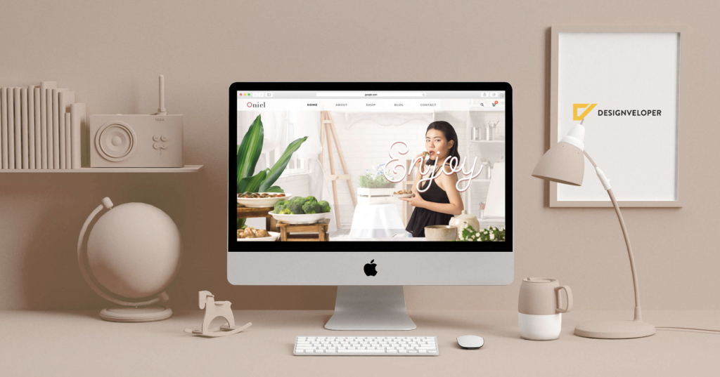
To end this part, let’s look at a well-practiced example from Designveloper:

There you go! We hope this article will help you with any web design mistakes to avoid and be more confident when designing a web or mobile app in the future. If you have any recommendations on this one, ping us on our Facebook, Twitter, or LinkedIn now!
But hey, provided that you are looking for a web design company then Designveloper could be the one. Tell us your idea now and we will realize it for you!
Also published on

Share post on


Table of Contents: