Ever wondered why some websites look stunning on any device? The secret is responsive web design, a strategy ensuring your website adapts effortlessly to diverse screens. Unveiling the magic behind seamlessly adaptable websites, responsive web design provides a flawless user experience across platforms and devices.
For designers and web enthusiasts hungry for inspiration, the quest for exemplary examples ends here. Dive into the world of 2024’s top 7 responsive web design examples, curated to spark creativity and innovation. Tailored for both theoretical insight and practical inspiration, this guide also unravels the growth of responsive web design and gleans insights from Designveloper’s expert advice.
Ready to transform your design projects? Let’s dive in!
The Growth of Responsive Web Design
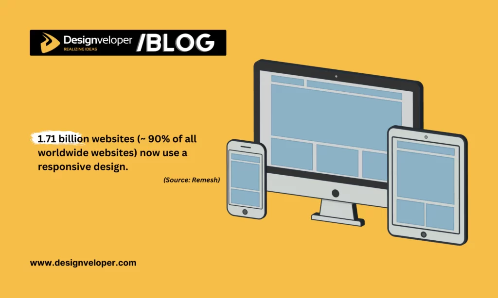
Do you know 1.71 billion websites (equivalent to 90% of all worldwide websites) now embrace a responsive design? This is not just a fad – it’s a survival strategy. As the digital world becomes increasingly mobile, websites that aren’t responsive risk becoming obsolete, ignored by users who expect seamless experiences across devices.
Responsive design is more than a technical requirement; it’s a key to unlocking a website’s full potential. It ensures that content can be easily viewed on any device, from desktops to smartphones. Here are some potential benefits a responsive design can bring to your site:
Improved SEO: Search engines like Google prioritize responsive websites. This means that these sites are more likely to rank higher in search results, leading to increased visibility and more traffic.
Increased Conversions: Responsive design ensures a seamless user experience, regardless of the device used. This can lead to higher engagement rates, more time spent on your site, and ultimately, more conversions. Whether it’s making a purchase or signing up for a newsletter, a responsive design makes it easier for users to take the desired action.
Enhanced User Engagement: Nearly three-quarters of web designers believe that a non-responsive design is among the top reasons making visitors leave a website. This statistic highlights the importance of a responsive web design in keeping your audience engaged and interested. But how? A responsive website is considered user-friendly, easy to navigate, and quick to load. These factors contribute to a positive user experience, encouraging visitors to stay longer and engage more with your content.
When delving into responsive web design examples for inspiration, you may discover some common design styles as follows:
Mobile-First Design
As of November 2023, more than 55% of website traffic came from mobile devices. Realizing the importance of mobile usage among users, Google prioritizes the mobile version of a website’s content for indexing and ranking, a method known as mobile-first indexing.
To ensure a mobile-friendly site and the best user experience across devices, Google suggests responsive web design as it is the simplest design pattern to implement and maintain. By initially designing for mobile devices and then progressively enhancing the experience for tablets or desktops, designers can ensure their websites reach the widest possible audience.
Fluid Grids
In fluid design, web designers use a percentage-based grid system to build page layouts, allowing web pages to resize themselves automatically to fit the size of the user’s screen or device. Besides, flexible images and typography adjust automatically based on the viewport size thanks to the use of CSS properties.
This approach ensures that the layout of the website is flexible and adapts to the screen on which it is being viewed. Accordingly, the website can provide an optimal user experience across various devices.
Adaptive Layouts
Using adaptive layout is another method used in responsive web design. Unlike fluid grids, adaptive layouts use multiple fixed layout sizes. In an adaptive layout, the website uses media queries to detect the type of device and delivers the pre-set layout for that device. This can include scaling images and adjusting typography to fit the layout. With adaptive layouts, designers can tailor the user interface to specific device sizes, providing a more customized user experience.
7 Responsive Web Design Examples to Inspire in 2024
As we step into 2024, the importance of responsive web design continues to grow. With an increasing variety of devices and screen sizes, creating a website that looks great and functions well on all platforms is more crucial than ever. In this section, we will explore seven responsive web design examples that are sure to inspire and inform your own design process. These examples demonstrate innovative approaches and best practices in creating flexible, user-friendly web experiences. Let’s dive in and see what makes these designs stand out.
Dropbox
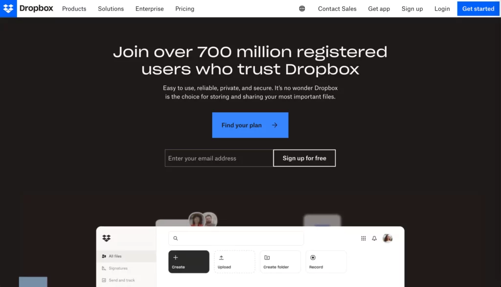
Dropbox is a cloud-based platform that allows users to store, sync, and share files. It provides a unified workspace where users can bring traditional files, cloud content, Dropbox Paper docs, and web shortcuts together in one place. Dropbox also offers tools for collaboration, making it easy for teams to work together from anywhere.
What Makes Dropbox a Good Responsive Web Design
Dropbox stands out as a prime example of responsive web design due to its dynamic interface changes and context-aware design for different devices.
Dynamic Interface Changes
Dropbox’s web page alters user behavior dramatically when used on different screen sizes. It adjusts its layout based on the user’s specific device parameters, providing a seamless experience whether viewed on a mobile phone, tablet, or desktop.
Context-Aware Design
Dropbox’s design is aware of the device it’s being accessed from and optimizes the user experience accordingly. For instance, the Dropbox mobile app simplifies common tasks and allows users to scan documents using their phone’s camera. On the other hand, the desktop experience was simplified with improvements to Windows Explorer, macOS Finder, and the taskbar/menu bar.
Airbnb
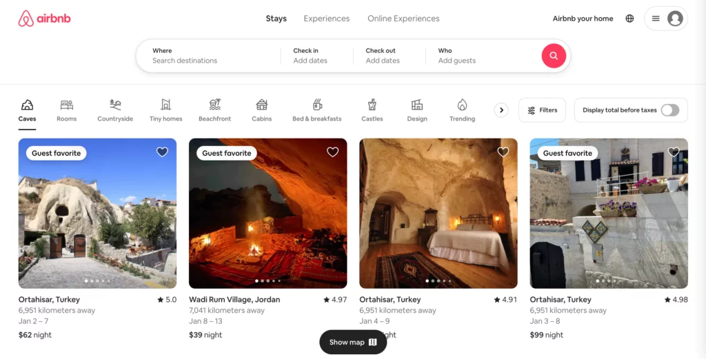
Airbnb is an American company based in San Francisco that operates an online marketplace for short- and long-term homestays and experiences. It connects hosts and guests who want to rent or stay in someone’s home. Whether it’s a work trip, weekend getaway, family vacation, or a longer stay, there are millions of amazing places to visit.
What Makes Airbnb a Good Responsive Web Design
Airbnb is a standout among responsive web design examples due to its user-friendly booking process across devices.
The booking process at Airbnb is designed to be streamlined and straightforward. Guests can book a stay with Instant Book, or with a reservation request. This process is optimized for various devices, providing a seamless experience whether you’re using a mobile phone, tablet, or desktop.
On mobile devices, the booking process is simplified, with clear calls to action and easy-to-navigate menus. Users can quickly search for listings, apply filters, view property details, and complete their booking with just a few taps.
On tablets, Airbnb adds benefit of larger images and maps, making it easier for users to explore listings and make informed decisions.
Meanwhile, Airbnb’s desktop version offers the most comprehensive experience. The booking process is designed to take full advantage of the larger screen real estate, providing users with extensive property details, high-resolution images, and interactive maps. Users can easily manage their bookings, communicate with hosts, and access other features such as wish lists.
Apple
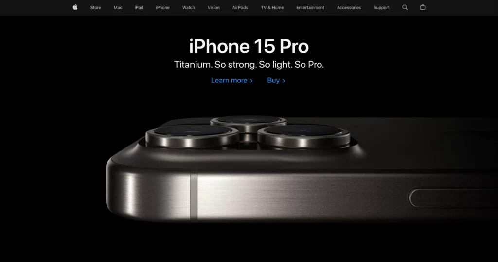
Apple’s website serves as a digital storefront for one of the world’s leading technology companies. It’s a platform where users can explore and purchase Apple’s wide range of products, including iPhones, iPads, Macs, and more. Additionally, it provides access to services like Apple Music, iCloud, and the App Store. But beyond its functionality, what truly sets Apple’s website apart is its responsive web design.
What Makes Apple a Good Responsive Web Design
Apple’s website is designed to provide a seamless experience across different devices such as mobile phones, tablets, and desktops. If you want to find some minimalist responsive web design for inspiration, don’t forget to take a look at Apple’s website. Here’s why:
Seamless User Experience Across Devices
Whether you’re accessing the site from a desktop, a tablet, or a mobile device, Apple’s website maintains a consistent look and feel.
On a desktop, the website has drop-down menus that appear when you hover over the categories in the top menu bar.
Meanwhile, mobile and tablet versions put an all-in-one drop-down menu on the right side of the top menu bar. When you tap on a category in the menu, a submenu opens with individual product pages and other helpful links, similar to the desktop experience.
Flexible Images and Grid-Based Layout
Apple’s website uses flexible images and a fluid grid-based layout that adjusts in real time as the browser window changes size. This ensures that images and elements are always displayed correctly, regardless of the device’s screen size.
Despite the high-quality images and animations, Apple’s website loads quickly and performs efficiently on all devices. This is crucial for maintaining user engagement and reducing bounce rates.
NASA
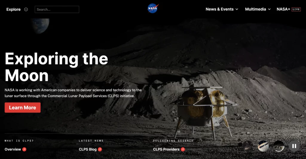
NASA, the U.S. federal government’s independent entity, is responsible for overseeing the civilian space program, conducting aeronautics research, and carrying out investigations in the field of space.
What Makes NASA a Good Responsive Web Design
When it comes to amazing responsive web design examples, don’t ignore NASA’s website. It’s a good inspiration for those who wish to design interactive elements and immersive storytelling from mobile devices to desktops.
Interactive Elements
NASA’s website is packed with interactive elements that enhance user engagement and learning. These include educational games, data visualizations, and immersive apps.
For instance, users can explore the surfaces of other worlds using real data returned from a fleet of spacecraft. These interactive elements are designed to be accessible and functional across different devices, contributing to the site’s responsive design.
Immersive Storytelling
NASA leverages immersive storytelling to engage users and communicate complex scientific concepts. This is evident in their use of story maps, which combine rich narrative text with interactive maps and NASA data. They also offer a 360 VR experience that provides immersive views of space station life and research.
These storytelling techniques adapt to the user’s device, ensuring a seamless experience whether on mobile, tablet, or desktop.
Patagonia
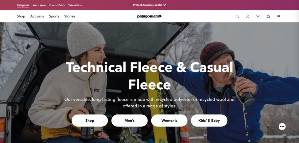
Patagonia is an American company that designs and sells outdoor clothing and gear for various activities such as climbing, surfing, skiing, snowboarding, fly fishing, and trail running. The company is known for its commitment to environmental sustainability and its high-quality products.
What Makes Patagonia a Good Responsive Web Design
Patagonia’s website is a great example of responsive web design for its use of high-quality imagery and responsive product pages.
High-Quality Imagery
The images on Patagonia’s website not only showcase the products but also convey the brand’s commitment to outdoor adventure and environmental sustainability. These images are designed to be responsive, meaning they automatically adjust to fit the screen size of the device being used. This ensures that the images look crisp and clear, whether viewed on a small mobile screen or a large desktop monitor.
Responsive Product Pages
These pages feature detailed product information, customer reviews, and related products. On a desktop, these elements are arranged side-by-side, making efficient use of the larger screen space. The tablet version’s layout on a tablet is similar but scales to fit the smaller screen. Meanwhile, these elements stack vertically to ensure easy scrolling and readability on mobile devices.
Dribbble
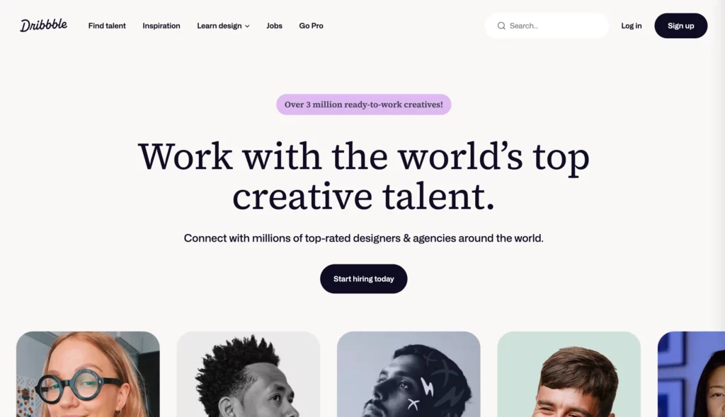
Dribbble is a global community for designers and creative professionals where they can discover, share, and hire creative work from thousands of designers. It serves as an inspirational destination for tens of millions of people.
What Makes Dribbble a Good Responsive Web Design
Dribbble’s website is one of the excellent responsive web design examples of responsive web design, demonstrating how a flexible grid layout can enhance the browsing experience across different devices.
On desktop and laptop computers, the website features a five-column layout. This layout condenses to two columns on tablets and mobile phones, ensuring the content remains accessible and visually appealing across all devices.
To prevent their website from feeling cluttered on mobile devices, Dribbble has made several adjustments. For example, shots are no longer attributed to their maker, and the view, comment, and like counts are no longer nested beneath each item. They’ve also hidden the menu behind a hamburger icon and removed the search bar.
The single-column display on mobile devices ensures visibility and minimizes clutter. It also plays into the tendency to scroll more when on mobile, so the user experience makes sense for mobile users.
Joynit

Joynit, developed by Designveloper, is a platform that brings communities together. It allows users to create, manage, and participate in events, fostering a sense of community and connection.
What Makes Joynit a Good Responsive Web Design
The website is responsively designed to display event information on calendars, provide detailed community pages, and more across devices. Joynit’s website is a testament to the power of responsive web design for some reasons:
Adaptive Layout Across Devices
Joynit’s website intelligently adapts to the device it’s viewed on.
On desktops, the menu is prominently displayed on the header bar, complemented by call-to-action (CTA) buttons for description and connection.
Tablets see a transformation with a drop-down menu and centrally placed CTAs to capture users’ attention.
Meanwhile, mobile devices provide a streamlined experience that focuses on the most crucial information in the center, with CTAs conveniently located in the drop-down menu.
Automatic Adjustment of Elements
Joynit’s website doesn’t just adapt; it evolves. Images, typography, and other website elements automatically adjust across devices. This dynamic adjustment ensures a consistent aesthetic and functional experience, irrespective of the device’s screen size.
How Designveloper Creates Responsive Websites: Tips from the Experts
At Designveloper, we understand the magic of responsive design. It’s not just about making websites look good on every screen; it’s about crafting experiences that feel effortless and intuitive, regardless of the device in hand.
We’ve poured years of expertise into mastering this art. But to be honest, the journey from vision to pixel-perfect reality isn’t always smooth sailing. We’ve faced our fair share of challenges, and through them, honed our expertise to deliver responsive web design examples that captivate and convert.
Tabular Data
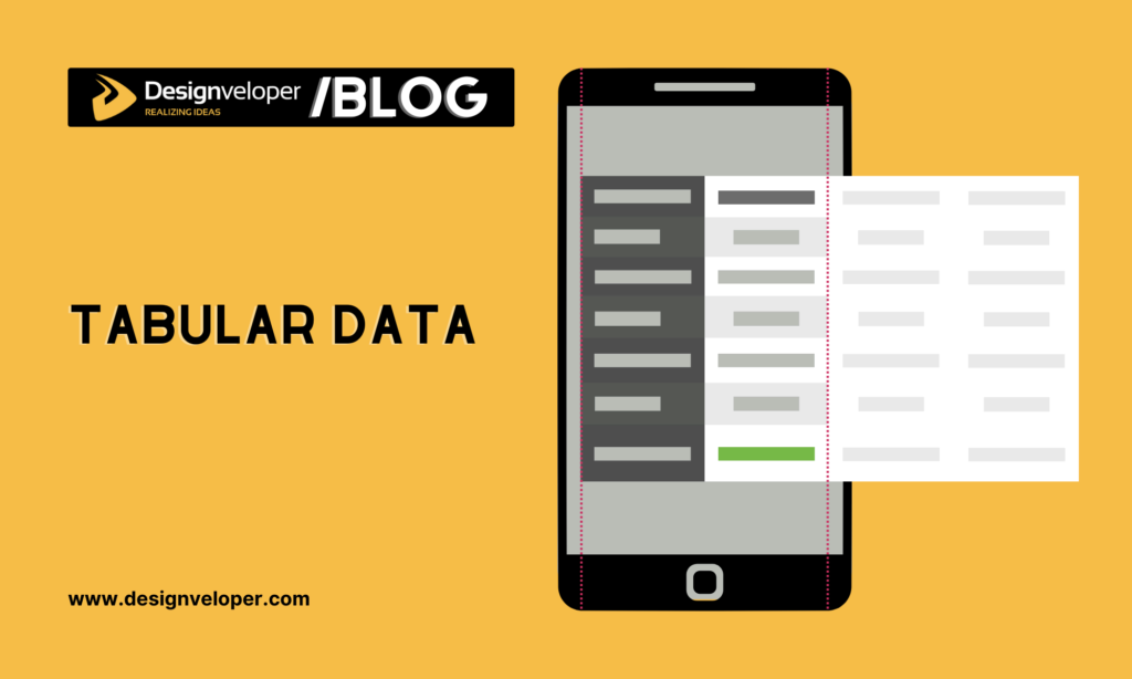
Tabular data is simply the data organized in a structured format that enables users to access, update, and retrieve information quickly and easily. In HTML, it is the content that lives in a table’s cells. Table contents can be numbers, text, or a combination of these. Tabular data, when designed responsively, can adjust to fit the screen size, making it easy to view and interact with the data.
Challenge: We have to deal with large volumes of data on small screens while preserving information completeness. Sacrificing information or cramming everything into a cramped space are both undesirable outcomes.
Solution: Here, we prioritize key data as key-value pairs and keep them visible on smaller screens. Less important data can be placed in a scrollable area, ensuring important information is always displayed.
Tab Navigation
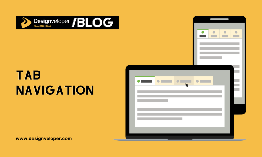
Tab navigation is a popular way of organizing content in user interfaces (UI). Particularly, the design pattern displays a series of labeled tabs used to navigate between different sections or categories of content on a webpage. Accordingly, tab navigation helps organize complex websites and allows users to quickly switch between specific content areas. It also provides a user-friendly way to access different functionalities without requiring endless scrolling.
Challenge: Displaying numerous tabs on devices with limited screen space is tricky and can clutter the interface.
Solution: For projects with a moderate number of tabs (5-7), we implement horizontal scrolling on smaller screens. Meanwhile, for larger numbers of tabs, we transition to a dropdown or accordion-style navigation on mobile devices for easier tab switching.
Calendar and Event Displays

These visual representations of calendars are used to display scheduled events, often with additional details like descriptions, timings, and locations. They provide users with a clear overview of important dates and activities. So, they’re crucial for websites related to scheduling, booking, or showcasing upcoming events.
Challenge: Displaying detailed event information on small screens, especially when dealing with a large number of events, is tricky. Tiny calendar dates and cramped layouts can lead to poor readability and user frustration.
Solution: On mobile devices, we display event lists or detailed event information in full-screen modals to provide more screen real estate. This enhances the touch and swipe interactions and avoids limitations posed by small calendar date cells.
These are just a few examples of how we at Designveloper navigate the challenges of responsive design, constantly evolving our techniques and pushing the boundaries of what’s possible.
Want to see our expertise in action? Take a peek at our portfolio, brimming with responsive web design examples that captivate across all screens. You’ll find websites that not only function flawlessly but also resonate with their audiences, leaving a lasting impression on every click and swipe.
Conclusion
You’ve just taken an amazing journey exploring the world of responsive web design, haven’t you? We’ve seen some best responsive web design examples and learned some cool tips from the pros at Designveloper. If these examples sparked some ideas and you’re thinking, “I want a fantastic website like that!”, then give Designveloper a shout. We’re here to help you create a website that’s not only beautiful but works like a charm on any device. So, what are you waiting for? Let’s start designing!


